So, a friend's project tried to blind me today with a hideous "random color" for a large area of text. The quotation marks are because it's hard to say what a "random color" even means. For most purposes, it means a color that is chosen solely as a label, and that therefore can be anywhere in the color palette. The usual constraint is that a set of labels need to be chosen, and so successive random colors should be easily distinguished…
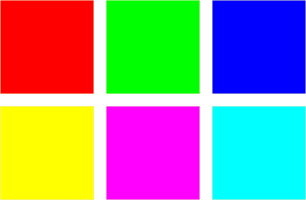
The problem here is that picking truly random RGB values is unlikely to work: you'll get a lot of near-black, near-grey, and near-white colors, and other combinations that are hard to distinguish and hard to use. Most folks, therefore, use the expedient of using colors chosen according to some algorithm. The easiest algorithm is to use fully-saturated RGB colors: pick any one or two of the RGB primaries and you get a visually unique color, giving six total colors for your labels. This approach fails for a couple of different reasons—the big one is that these colors are pretty ugly separately, and really ugly together. The six colors in question are these:Specifically, I got the color in the lower center, which Inkscape calls "Fuschia". I personally think it's the ugliest of the six except maybe for Red. The Yellow is pretty unusable also, though.
So after some quick experimentation, my initial recommendation was as follows: In the HSV color space, colors are distinguished by their "hue" (what color they are), "saturation" (how intense or "faded" they are), and "value" (how light or dark they are). The lightly saturated, full-value pastel colors tend to look good on the screen and be distinguishable, without being objectionable. Further, one can get more than six quite distinguishable shades this way. So the basic idea here is to first walk the HSV hue circle with a saturation of 20% and a value of 100% at 60 degree increments, giving six unique pastels that are essentially pastel versions of the saturated colors: If additional colors are needed, another six can be obtained by moving to a saturation of 40% and a hue offset of 30 degrees and walking the hue circle at 60 degree increments again. This will give six more easily-distinguished and still not too obnoxious colors:Actually, depending on what you're doing, you might want to start with these.
The thing you might notice about these colors, though, is that some are much more easily distinguished than others. The problem is that HSV and its close relative HLS (which Inkscape uses and which was therefore actually used to produce the figures above) are "geometric" color spaces. What is wanted is to walk off colors in a "perceptual" color space such that colors are distinct in proportion to how far apart they are.
Sadly, the state of the art in usable perceptual color spaces for the web is pretty far behind the times. You can easily find a converter from the CIELab color space to RGB, but CIELab still isn't too great perceptually; worse yet, it doesn't really provide the right coordinate system to do the trick we were using. The latter problem could be solved by switching to the CIELCh(ab) color system—good luck finding a converter for that. The former problem could be solved with the CIECAM02 perceptual color space. But that space is arcane in the extreme, and really only supported by "color management systems" that also want to do a bunch of other things for you. CIECAM02 is a relative space, so you'll need to pick a white point for your image, and then convert to sRGB at the end.
I think this more sophisticated approach could achieve a lot better results. But I really doubt I'll have the time to code up a demo and display some images anytime soon.
Back to work with me. (B)